Modern Dashboard
This time I’d like to share something new. Dashboard with dark background and rectangle sections for specific groups of measures. I called that “modern dashboard” because of its unusual design and colors, but in general it’s still a standard overview dashboard covering Sales metrics and some business questions can be answered.
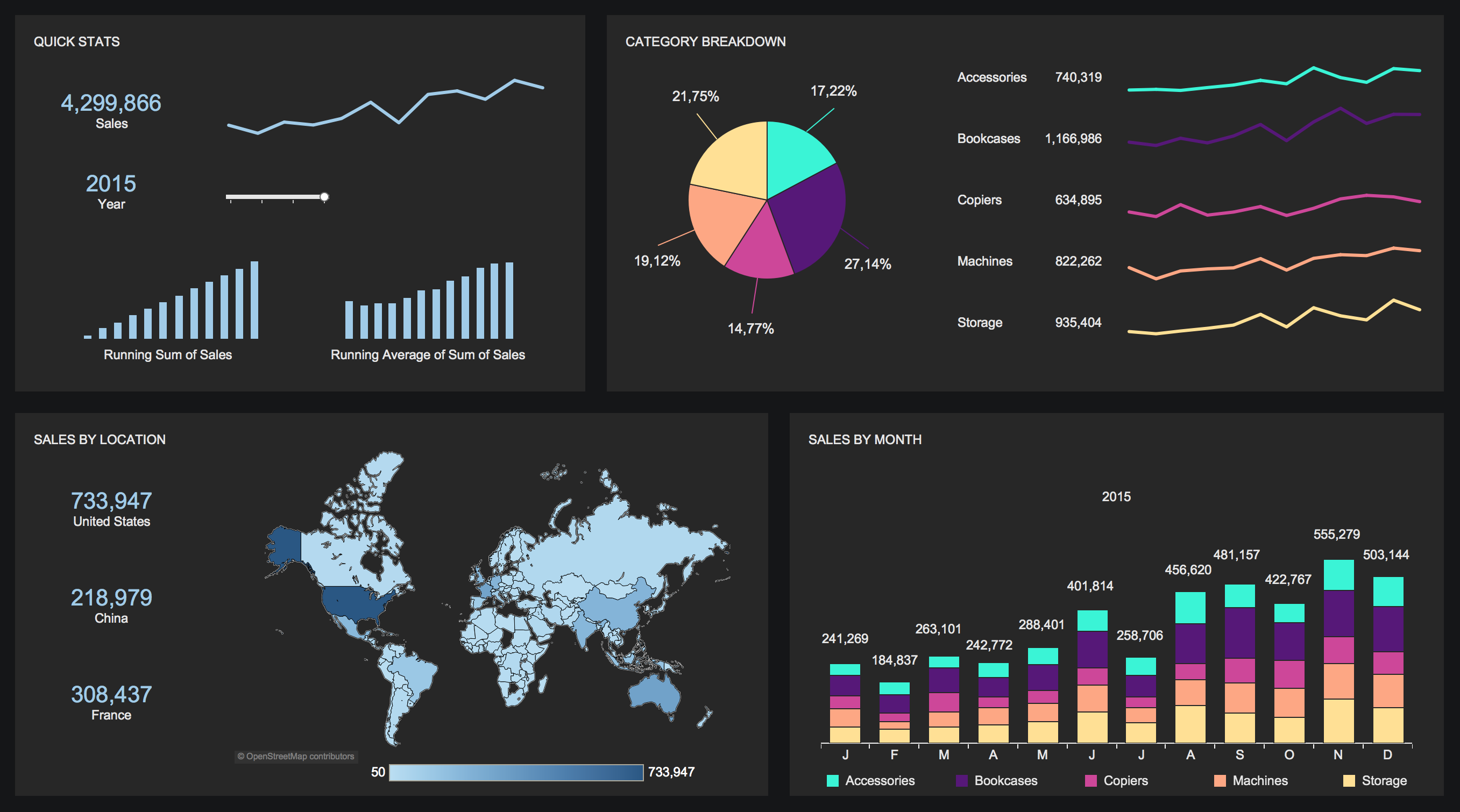
Running Sum of Sales and Running Average of Sum of Sales.
As you know – Running Sum or Running Total is the summation of a sequence of numbers which is updated each time a new number is added to the sequence. Simply it’s adding the value of the new number to he previous running total. In our case – adding month to month value which creates sum of all months at the end.
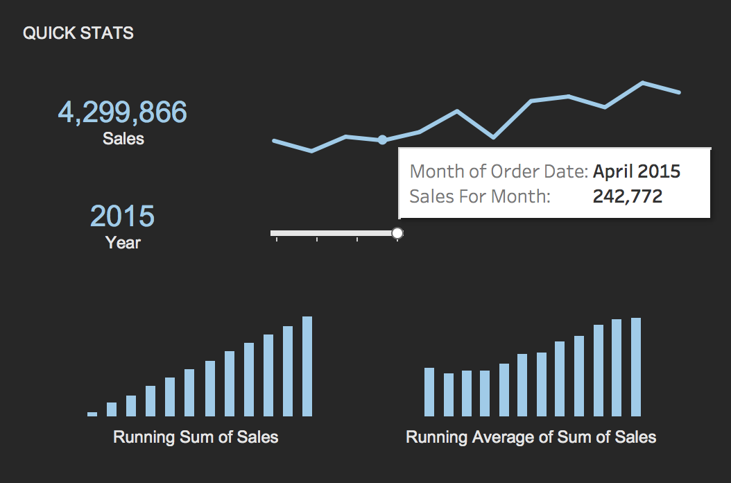
But what is Running Average of Sum of Sales? In this case it’s just Average of monthly sales with the same trick like in Running Total – For February it’s Average of Sum in Jan and Sum in Feb. For March it’s Average with additional value of Sum in March and so on.
Category breakdown on first screen?
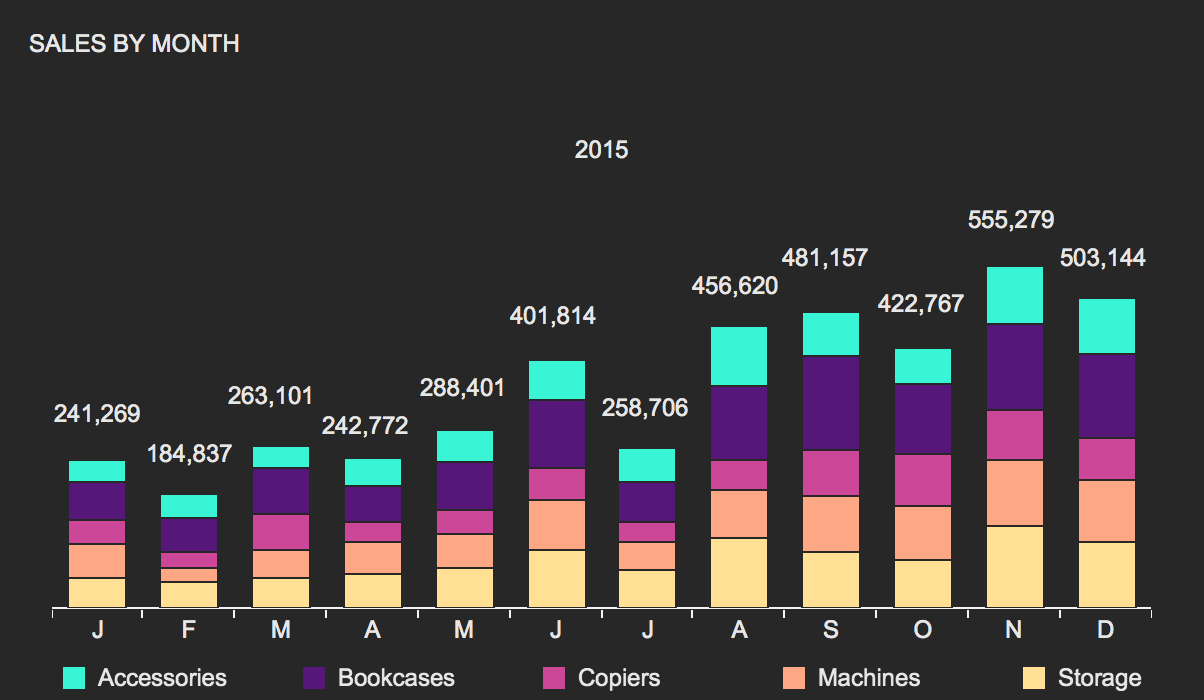
Having one-dashboard-only Business Intelligence application it’s important to show all strategic metrics with no further analysis needed. Nicely expanded product categories with trend lines and percentage of total quickly show sales condition.

Consistent colors.
Specific colors are used to communicate particular messages. I’m not a fan of using different colors for dimension details, like for particular products in one category dimension. I would rather pick one color for all categories and use gradient for measure’s values. But showing these details in few visualizations on one screen it’s good to make them quickly recognized, so I suggest to use very individual and consistent colors to underline the same categories and for me it looks perfect.
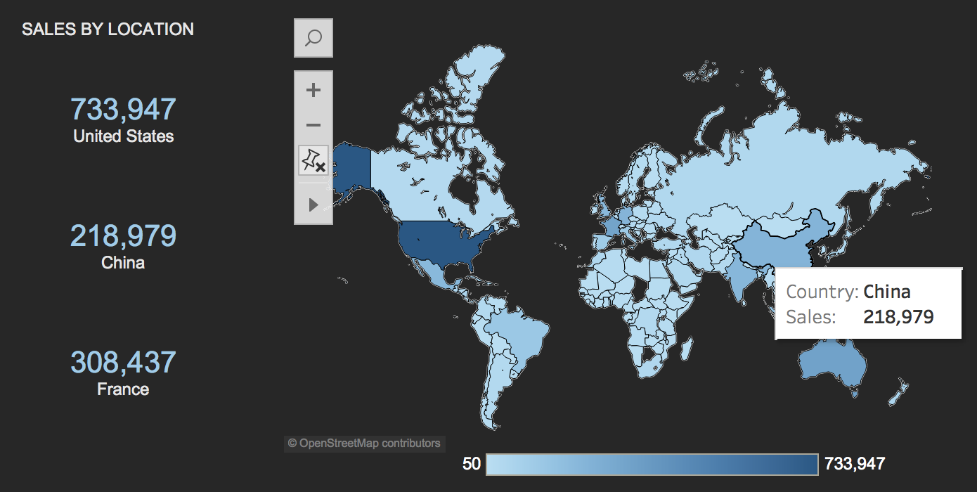
Sales by location.
Talking about color gradient for measure’s values – here is a great example. As in most visualizations – more intensive color means a higher number while lighter means a lower values. Note that some of the most important locations are additionally expanded in individual KPIs.
OK, I hope you like it. Don’t forget to open Tableau Public for dynamic version of this dashboard and go to my other visualizations for more fun!